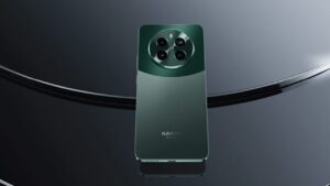
Spice smartphone brand to be relaunched after forming joint venture with Transsion Holdings
2 min readTranssion Holdings, a global conglomerate with a strong presence through itel and TECNO announced a joint venture (JV) agreement with Spice Mobility, an Indian Business major across mobility space, to strengthen its foothold in the world’s fastest growing mobile market.

In line with Transsion’s multi-brand strategy, the company marks the entry of its new brand in India, reinforcing its commitment to the India market, with an enhanced portfolio. This partnership aims to revitalize the ‘Spice brand’ by cross leveraging both organisations’ strengths to offer a simple, yet, an all-new powerful and rich digital experience to the young generation of India, which is a reflection of their individuality and keeps the collectivistic sentiment intact. The new Spice brand portfolio will offer stylishly designed devices catering to the needs of the Indian youth.
Spice Brand unveiled its new brand identity and philosophy – “Make Sharing Better” with Spice. In line with the new brand identity, Spice Brand will enable the users’ to create and nurture the social connections by sharing content that is enjoyable for them.
Read More: TECHGIG ENTERS THE GUINNESS BOOK OF WORLD RECORDS
The philosophy “Make Sharing Better” with Spice embodies collectivism and promotes social cohesion & interdependence in the Indian society. Following these principles and such interdependence amongst families in India, ‘Sharing’ has become a cultural norm. The new Spice is all about enhancing the experience of joyful, carefree, energetic youth population who believe in sharing moments and individuality.
In this connected world, Spice further will fuel the culture of ‘sharing’ to help build a rich social connect for the Indian youth. The product portfolio comes equipped with easy to use features that is designed especially to promote a superior digital exepreince, thereby making ‘sharing’ fun.
The new distinctive logo denotes a youthful, vibrant, energetic and carefree brand. The identity is designed around the core values of the target audience – The ‘Youth’. The Purple is a very unique and vibrant colour, which signifies the stability of Blue and the energy of Red. The colour is also in line with our range of colourful and uniquely designed products.
he font reflects the directness and at the same time, resonates with the old brand logo with the aim of being true and direct with the consumers. The uniqueness of color also talks about the unique offerings for the consumers. The rhythmic wave in the logo symbolizes dynamic relationship that the brand aims to establish with the carefree and joyful youth.


